top of page


Rebranding Project
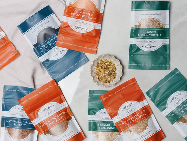
Pouches
We created a fully printed pouch with a clear window so you can see the amazing product inside! The bold new colors aren't just beautiful - they represent the different categories of products at Salt Sisters. In this case: orange for rubs, green for herbs, blue for salts, and yellow for dips.


Front

Back

Gusset


Small Pouches
We created smaller pouches for flavored salt and single-use dips.
Flavored Salt
Dips


Jars
We created jar labels for updated glass jars with metal lids as well as lollipop stickers for the lids, so that you can easily see what's on your shelf or in your drawer.


Salt

Herbs

Rubs

Infused Salt


Other Packaging
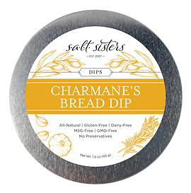
Dip can label

Cheeseball cards
Grinder tube labels


bottom of page